Welcome to luisrsantos.com
multicreative
- +34 910 403 706
-


blog
myblogmyblogmyblogmyblogmyblogmyblogmyblogmyblogmyblogmyblogmyblogmyblogmyblogmyblogmyblogmyblogmyblogmyblogmyblogmyblogmyblogmyblogmyblogmyblogmyblogmyblogmyblogmyblog
abcdefghijklmnopqrstuvwxyzabcdefghijklmnopqrstuvwxyzabcdefghijklmnopqrstuvwxyzabcdefghijklmnopqrstuvwxyzabcdefghijklmnopqrstuvwxyzabcdefghijklmnopqrstuvwxyzabcdefghijklmnopqrstuvwxyz
myblogmyblogmyblogmyblogmyblogmyblogmyblogmyblogmyblogmyblogmyblogmyblogmyblogmyblogmyblogmyblogmyblogmyblogmyblogmyblogmyblogmyblogmyblogmyblogmyblogmyblogmyblogmyblog

insights
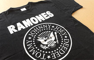
“Hey, Ho, Let’s Post!”
I borrow Joey, Johnny, Dee Dee, and Tommy, one of their most celebrated battle-cries to use it as the title for the first column of my blog, trusting, in my condition of a diehard fan, that they will agree without any major objections. Not only because it is a magnificent statement of intentions condensed in a few words, but also because there is something about Ramones that really catches my attention for some time now.
Definitely, Punk is not dead: the Ramones brand remains, and survives not only the legendary New Yorker group as such, but also each and every one of its members (RIP).
This can be noted with no more effort than going shopping around for the fashion shops, many of those with an Anglo dye, that populate the streets of Madrid; surprisingly–at least for me, as I grew up to the sound of thunderous chords of “She’s The One” or “Sheena Is A Punk Rocker”–hundreds of Ramones tee shirts hang from hangers in those shops, nearly forty years after the birth of the band.
Definitely a case study in the field of branding.
Why do so many sell Ramones tee shirts nowadays? What is it that causes that, so many years after their last concert-it took place in 1996, the Ramone graphic keeps booming?
There is probably no simple answer to these questions.
It is not my intention here to analyze the phenomenon from a musical point of view, although I’m sure the Ramones music’s idiosyncrasy is one of the reasons for the longevity of the brand. But only to some point.
Indeed, the music of the Ramones, characterized by vigor, ease and energy, also has some degree of eclecticism. From the fast pace of “Today Your Love, Tomorrow The World” to the melodic strains of “Baby I Love You” there is a whole range of possibilities which can satisfy the most diverse tastes-not other genres lovers’, but those who enjoy more or less “hard” rock, without falling into labels.
Nevertheless, Ramones never got to reach the “top of the pops” they–and their record labels–pursued. However, their icons are still “top of the pops” eighteen years after his last performance.
Although I do not know if the youngest amongst those who buy and wear these tee shirts have ever heard a song by Ramones, I suspect that in some cases they haven’t. This would make this phenomenon even more striking, since it would be no longer a case of a group’s fans… But fans of a brand, instead.
Most likely, both the logo and the symbol created by Arturo Vega (also RIP) have much to do with the enduring success of the Ramone graphics. Blunt and sober, with enough elements to become emblem for not only a group, but a generation, the graphics designed by Arturo Vega–we do not know to what extent intuition and reasoning played a part in its creation—was destined to survive for a long time, for several reasons:
It is simple: Despite bringing various elements, the symbol is, from a visual point of view, quite simple: circular shape; black on white or white on black; a solid and timeless typography… And the names of group members, arranged around the central symbol.
It is easily recognizable: The use of the symbol of the Congress of the United States of America, amended with a touch somehow naive-the baseball bat, rather than a reference to violence, appears to find its origin in Johnny Ramone’s love for that sport–makes of the Ramones emblem an “American icon” from the first moment.
It is eye-catching and impactful: The emblem combines with great success the two typefaces in which the logo itself–”RAMONES”–, and the names of the members of the group are respectively composed, with the graphic elements of the symbol, creating a truly striking image.
Arturo Vega did a great job of branding in the graphic field. But is there anything else that has contributed to the Ramones brand to become a universal icon?
Obviously there are other aspects of the Ramones branding that could not have gone unnoticed.
Particularly, I have a predilection for Joey—and it seems I’m not the only one: U2 just released an album on iTunes, in which there is a song called “The Miracle (Of Joey Ramone)”—its ungainly appearance and the apparent mixture, at equal parts, of romanticism and hardcore. But all members of Ramones have a personality and together form a group with one of the strongest visual identity of all ages. Those tight, frayed to tear jeans they used to wear—probably the precursors of such fashion—may be part of a product’s branding.
The Ramones are a unique case in this regard. If we normally mean by the term “product of marketing” a vacuous, perhaps dull, thing, yet it is endowed with personality and image through an advertising campaign in which much money is invested to the point of turning this “thing “in a commercial success, then you could say that Ramones are the antithesis of a product of marketing. And I think this is a key factor in understanding the longevity of Ramones as a brand: From the beginning they had a very clear idea of what they wanted to do, what their collective topics of interest were—despite the natural differences between their different personalities as individuals, and also had a very specific environment, so their branding developed in a “spontaneous” manner over time. As spontaneous as the product they proposed.
Speaking of the product… How many brands could you think of, that have remained on the market for long, even when such product has not evolved at all for almost twenty years–almost half of the brand’s life–, and without any advertising?
I guess not many.
The truth is that the product made by Ramones, yet being somewhat eclectic, it’s mostly very consistent. And I mean every facet of their artistic production: their music and lyrics of course, but also their videos, movies, comics, and literary references. Even when they sporadically venture into a more melodic terrain, or when sound more hardcore—especially in his later records—they keep their identity intact.
It could be stated that Ramones is a good product—even though such music horrifies many—simply because a large number of people like it.
Thus, we have a great brand from the visual point of view, an extraordinary branding in what is related to other facets that are not the emblem itself, and a good product; surely all this is enough to explain the durability of the Ramones brand.
But there’s more. For those who know and have enjoyed the group—and those who sell their shirts, and other merchandising, are aware of this—the successive deaths of Joey, Dee Dee, Johnny and Tommy—the first three in the course only three years, between 2001 and 2004; and the latest, this year—Ramones have risen to the category of myth. There are cases in which death brings with it a “market-pull” and this could be one of them.
It is possible that, as time passes, when the disappearance of the group members is no longer recent, the New York band’s tee shirts also disappear from the shops to which I referred at the beginning; but even so, I think the Ramones brand will accompany us for many years .
stuff I like
An outstanding typeface collection: Hoefler & Co.
Hoefler & Co.—until a few months ago, Hoefler & Frere-Jones—is a type foundry established in New York by American typographer Jonathan Hoefler. Obviously, the term “foundry” refers to the traditional way of making types and not the current procedure, but many typographers still use it.
Jonathan Hoefler joined their knowledge on the subject to Tobias Frere-Jones’, also American typographer, in 2004. In the ten years since then they have designed some truly remarkable typefaces.
Hoefler & Co.—its website can be accessed at www.typography.com— currently offers thirty eight typefaces in his magnificent collection. Among them, some classics, such as Didot, and other highly successful in recent years, as the applauded—and perhaps overused—Gotham.
From my point of view, the best thing about this foundry is not a single one out of the thirty eight typefaces hurts.
The proliferation of origins—many of them, spurious—of typefaces that has taken place during the last years has produced a number of replicas and substitutes, in many cases of dubious quality, of some of the most respectable typefaces in the history of foundries.
This has resulted in some “devaluation” of the importance of typography itself, so that it would seem irrelevant whether a typeface was designed better or worse, as long as an “a” looks like an “a” and a “m” looks like a “m”—sometimes I think this kind of trivialization of things is spreading in many areas of learning, but this would be a topic for another article.
Against this trend, Hoefler & Co. has a remarkably neat collection with very different styles, able to serve for many designers and very different purposes.
There is no typeface in this collection which use I would refuse beforehand. On the contrary, I would like to have projects that fit this or that font; there are some really great ones: Tungsten Rounded, Nitro & Turbo—a curious dual typeface with letters slanting to both sides respectively—, Landmark, Publisher,…
Anyone want to make me an assignment that is suitable to use these typefaces?
Furthermore, Hoefler & Co. offers cloud.typography, a “cloud” of typefaces accessible by subscription at fairly reasonable prices, taking into account the quality of the available collections. Prices vary depending on the number of visits that a website in which they are used gets.
Moreover, Hoefler & Co. maintains a website worth a renowned type foundry. If the main purpose of a typeface is design, typography.com honors that purpose. Not only it is well designed and attractive, but also it offers useful sections for the typographer or graphic designer, such as Techniques o Discover Typography, both pages that propose interesting resources for design professionals.

+34 910 403 706
Designed by Luis R Santos on Adobe Illustrator 18 and Adobe Photoshop 15. Developed by Luis R Santos on
WordPress and Headway. Bilingual functionality powered by WPML. Fonts from the Adobe Typekit collection. For best results, please use the latest versions of modern browsers whenever possible.
© Luis R Santos
Leave a reply